
Find your ideal home rental match
Matchahome
Project overview
Matchahome is a mobile application that matches users with home rentals based on their requirements and preferences. The goal of this app is to provide a seamless and personalized experience for users searching for their perfect home.
Details
Project type: Academic Case study
Role: UX Researcher, UX / UI Designer
Duration: 5 months, October 2022 - February 2023
Tools: Figma, Invision
Problem
The problem space was centred around the statement that affordable housing rentals in Canada are hard to find.
After doing initial research, I found out that Housing affordability is a pressing concern for many families and The last time housing was considered affordable was in 2003-2004.
Design Process

Discover phase: Identify problem/opportunity, research and gather information, analyze and synthesize insights.
Define phase: Identify key insights, define the problem statement and user needs, and generate ideas and solutions.
Develop phase: Prototype and test solutions, iterate and refine solutions based on feedback.
Deliver phase: Finalize and implement the solution, evaluate and measure impact, plan for future improvements.
The Double Diamond Design Process is a framework I use to solve design problems.
Discover
User interviews
I conducted 4 user interviews to determine our target audience and to gain a basic understanding of our users.
Based on the responses, here are the key insights presented below
The majority of data fell under "Requirements and preferences."
"Affordable" is subjective in relation to a person's priorities when renting a home.
Renting a home is sometimes overwhelming and time-consuming.
Users struggle to find a home that meets their needs and preferences.
Rental websites lack personalized recommendations and filters or make it confusing to do so.
The goal for creating a rental experience should be to meet most of the tenant's requirements and preferences to ensure their satisfaction with the rental.e.
Define
Using these insights I created a "how might we" statement to focus on.
How might we support adults in renting affordable housing based on their requirements and preferences so that they feel confident in renting a home?
A persona was created through my primary and secondary research findings about the users of the Matchahome app. The persona represents my target users, which will allowed me to better understand and make design decisions accordingly.

After this I created an experience map that visualizes how my target audience currently experiences the problem space.

Then, I created user stories for my solution and grouped them into epics. I selected the "Updating Preferences" epic to focus on.
Within this epic, I chose the user story "As a Renter, I want to be matched with preferred listings" so that I can quickly schedule an appointment.

This led to the Task flow of finding a home rental match.
The user scenario is a A returning user (renter), Audrey wants to find a new place to live in a shared unit. She wants to update her profile with her preferred location, price, and home preferences. After this, she is matched with home rentals based on her preferences. She wants to view the cheapest option, save it for later, and view her saved home rentals.

Develop

I developed wireframes of the solution, starting with sketching the flow and then choosing the best sketches seen here, which reflects the six screens in the task flow.

Next, I created initial grayscale wireframes of the six screens, which can be seen here. During this process, I made minor changes to make the design look less cluttered.
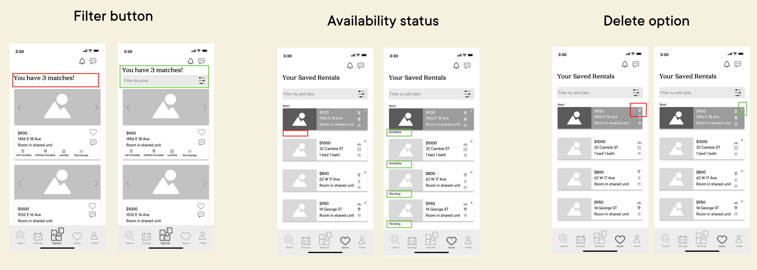
After this, I tested the prototypes on five users, received feedback, and did iterations.
To prioritize what to iterate first, I used a prioritization matrix. This helped me determine what was most important versus what would be nice to have. I did a second round of testing, which led to my final greyscale wireframe.
Here are a few iterations I did to improve the wireframes:
Before creating the final high-fidelity wireframes, I gathered inspiration and developed my brand identity, which consists of brand colors, a wordmark, and an app icon. I chose fun and vibrant colors to make users feel excited to use the app.
Brand colours
Dark purple is my primary colour as it is vibrant yet not distracting. It it used for headers, icons and branding.
Salmon (light pink orange) is used for the main CTAs
Light beige is used for the words and icons on the dark purple/darker backgrounds to give it contrast. It is also used for pop-up headers.
Turquoise is used for accents and branding.
Off-black is used for wording, and small CTAs.

Wordmark
After looking through some inspiration, I knew the background for the top bar in my application might be purple, so most of my ideations were against a purple background.
I was deciding between all caps and lower case and finally decided on all lower case.

App Icon
I created my application icon earlier on in the process as I knew that I wanted to showcase the function of the app in an image of a house and a puzzle piece to represent Matching to a home.

Finally, I implemented my brand identity to create high-fidelity wireframes.
Deliver


Marketing Website
Desktop

Mobile

Alternative Platform
Desktop

Throughout this process, I learned that finding the problem before the solution was a key part of creating a purposeful product for the user, with a higher chance of success. Although I haven't tested it out as a real-life app, going through the process and user testing made it a lot clearer. When I was creating the wireframes, I was uncertain whether it would be just another general home rental site that already existed. However, during user testing, I received affirmation from my testers that having a simple interface where they could input their requirements and preferences without seeing other properties that they wouldn't qualify for or couldn't afford made it less overwhelming.
Looking back, and if I had more time, I would have expanded my user interviews to include a variety of participants from different backgrounds to gain more accurate insights.
Key Learnings

Future Thinking
I drew a card from The Tarot Cards of Tech and it got me thinking about the various groups of people who could be excluded from using the app. One of the groups that came to mind were lower-income earners. While I interviewed a diverse group of people, I realized that I did not specifically focus on this demographic. Therefore, it is crucial to include them in the problem space when creating a solution like this.
This is necessary to ensure that everyone, regardless of their financial situation, has a chance to experience something like this. This could be achieved by reaching out to community organizations that serve lower-income individuals, conducting additional interviews with people from this demographic, or even partnering with companies that cater to lower-income earners. By doing so, we can ensure that the app is accessible to all and that no one is excluded from the benefits it provides.